
The supplement industry is an incredibly competitive one and companies must work hard to differentiate themselves and carve out their own loyal audiences. We discussed the idea of developing a marketing strategy in our previous blog. Product packaging is a major part of building your brand identity.
Your packaging should reflect your target audience and the segment of the market you’re aiming for. Are you trying to reach people who love the great outdoors, bodybuilders, the weight loss market, sports performance, or people who like to work out but who aren’t defined by the gym?
Appearances Are Everything
Many consumer purchases are emotionally driven. This is perhaps best evidenced in the world of over-the-counter painkillers. Acetaminophen, also known as paracetamol, is available in generic form for just a few cents per dose, yet brand-named Tylenol costs five times as much. The ingredients are the same, yet people are willing to pay more for the brand name and more attractive packaging.
As a brand owner, you need to convey a clear message with your supplement packaging:
- What does the product do?
- Who is it for?
- Why is your supplement special?
According to one recent study performed by the Paper and Packaging Board and IPSOS, 72% of consumers state that their purchasing decisions have been influenced by packaging design. Packaging matters for brand recognition, and also for catching the eye of a consumer and creating the emotional connection that signals “this brand is for them”.
Make Your Supplements Stand Out with Packaging Designs
Whether your products are going to be sold in supermarkets, health food stores or dedicated supplement stores, you need to make sure that they stand out. Funky designs and eye-catching colors are a good starting point. Take a look at rival products. It’s likely most weight-loss products designs involve a lot of white, most “hardcore bodybuilding” supplements include a lot of black. What can you do to make your product different?
Funky Graphics and Colors
Multivitamin brand Gumi does a good job of making vitamins and minerals less boring. Their logo is instantly recognizable, and their products have bright, bold designs that reflect the individual product (such as ‘sun’ for Vitamin D2, or ‘fruit’ for their basic Multivitamin), and that visually ‘jump off the shelf’).
Another brand that does a good job with simple colors is Eboost. Their simple green, text-heavy packaging is something that is instantly noticeable on a crowded shelf, and that makes it clear exactly what the product is. You have only a few seconds to attract attention, and they do a good job of stopping the eye on their product when a busy shopper is scanning the shelves.
Get Fancy with Packaging Effects for Premium Products
If you’re marketing a premium product you need to make your packaging look special. Shoppers paying a dollar or two for an energy bar just want something that tastes good and looks OK. People who are paying more for high-end supplements want an ‘experience’, and the package is a part of that. Supplement brand Nativetech is an example of this. Their boxed supplements come in understated boxes with a satisfying heft to them, and with embossed foil fonts for a touch of class. Their pill bottles also use the foil fonts for the company name, adding to brand recognition.
Distinctive Form Factors & Shapes
Over the years, some companies have tried distinctive shapes as a marketing tool. This can sometimes work well, but it can sometimes backfire. Stores have limited space on their shelves, and premium retail space such as the areas in front of POS units are highly sought-after. Shelf stackers don’t want to mess with awkwardly shaped bottles, and if your product doesn’t stack easily to fill a shelf then you may find that you aren’t given as much prime retail space as you would like.
If you’re selling online, primarily, then this may be less of an issue and a creative/unique product design could work in your favor. You can also try personalizing your products; for example, Care/of offers daily doses of supplements with the user’s name included on each dose packet.
If you’re selling via stores, stick to simple tweaks. GoSimple, for example, deviated from the standard bottle design, but their ‘jar’ is still flat bottomed, stacks easily and will fit on shelves. It’s distinctive enough to get noticed, but not different enough to cause problems.
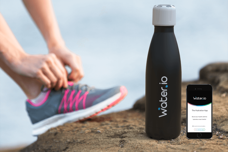
Connected Packaging
Visually differentiated supplement packaging will definitely give you that extra push you are looking for with your brand. But why not take it one (major) step further?
With Connected Packaging you can turn your supplement product into a digital entity, that will stimulate two-way communication between the brand and its customers. The brand will have visibility into how their products are being used, and the customer will get a digital coach that supports them in reaching their wellness goals. It really is a win-win situation.
Vitamins.io provides three features: Remind – Your customers won’t forget to take their supplements. Replenish – They will receive a reminder to buy the new supplement bottle, right before it runs out. Relationship – Open up to new engagement options and experiences, improving brand loyalty.
Send a Clear Message
Plan your packaging carefully. It’s the first thing that shoppers will see, so it makes sense to invest in quality designs. Your packaging tells shoppers who you are, and whether your supplements are for them. Make sure the answer is “yes”.